The New York Times app provides in-depth, independent, original reporting. Our breadth of coverage reaches well beyond news and politics, and it’s a deep resource for topics that touch our readers’ daily lives, including opinion, arts and culture, business, tech, wellness and much more. The app is free to download.
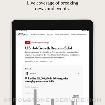
The world, reported.
Read, watch and listen to original reporting by 1,700 journalists in over 160 countries. From breaking news and live updates to investigations and cultural commentary, The New York Times app helps you understand the events shaping the world.
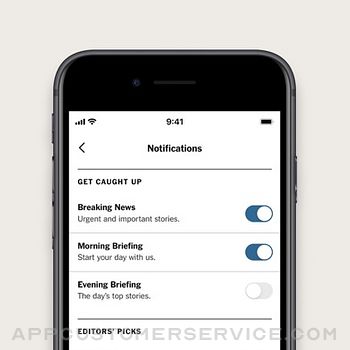
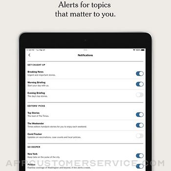
Alerts that you select.
Be the first to know with push notifications based on your interests. Get caught up with morning and evening briefings. Go deeper on business, politics and sports. Know what to cook, read and watch. And read the latest by your favorite columnists.
Unwind with the Play tab.
New word, visual and number games arrive every day. Wordle, Sudoku and The Mini are free to enjoy, while subscribers have unlimited access to Spelling Bee, an archive of more than 10,000 crossword puzzles and more.
Your interests, inside one tab.
For You is where we recommend news articles, magazine features, games and special collections with your reading habits in mind. Whether you have a few minutes or a few hours, this tab is a destination focused on you.
Subscriber exclusives.
Share up to 10 gift articles a month, even with nonsubscribers, in the app or online. And sign up for subscriber-only newsletters that go deep on everything from food, culture and climate change to parenting, health and politics. Plus, there’s more coming soon.
Today, at a glance.
Add The New York Times widget to your home screen and keep the latest headlines close by. Top stories will automatically refresh, helping you stay in the know throughout your day.
DIGITAL SUBSCRIPTIONS
Enjoy everything we offer with a New York Times All Access subscription, which includes unlimited access to:
— Investigations, culture and analysis from News
— Word, visual and number puzzles from Games
— Recipes, plus advice and inspiration from Cooking
— Independent product reviews from Wirecutter
— In-depth, personalized sports coverage from The Athletic
See our subscription offers for further details.
PAYMENT AND AUTOMATIC RENEWAL TERMS:
IF YOU SUBSCRIBE TO THE NEW YORK TIMES VIA THIS APP, PAYMENT WILL BE CHARGED BY APPLE TO YOUR APPLE ID ACCOUNT AT CONFIRMATION OF PURCHASE. YOUR APPLE ID ACCOUNT WILL BE AUTOMATICALLY CHARGED FOR RENEWAL AT THE APPLICABLE RATE SHOWN TO YOU AT THE TIME OF SUBSCRIPTION EVERY CALENDAR MONTH (FOR MONTHLY SUBSCRIPTIONS) OR EVERY YEAR (FOR ANNUAL SUBSCRIPTIONS) WITHIN 24 HOURS PRIOR TO THE END OF THE CURRENT BILLING PERIOD. YOU WILL BE CHARGED IN ADVANCE. YOUR SUBSCRIPTION WILL AUTOMATICALLY RENEW EACH MONTH OR YEAR UNLESS IT IS CANCELED AT LEAST 24 HOURS BEFORE THE END OF THE CURRENT PERIOD. TO CANCEL, PLEASE TURN OFF AUTO-RENEW AT LEAST 24 HOURS BEFORE THE END OF THE CURRENT PERIOD. YOU CAN TURN OFF AUTO-RENEW AT ANY TIME FROM YOUR ITUNES ACCOUNT SETTINGS. CANCELLATION TAKES EFFECT AT THE END OF THE CURRENT BILLING PERIOD.
BY DOWNLOADING THE NEW YORK TIMES APP, you agree to:
• The automatic renewal terms stated above.
• The New York Times Privacy Policy: https://www.nytimes.com/privacy/privacy-policy
• The New York Times Cookie Policy: https://www.nytimes.com/privacy/cookie-policy
• The New York Times California Privacy Notices: http://www.nytimes.com/privacy/california-notice
• The New York Times Terms of Service: https://www.nytimes.com/content/help/rights/terms/terms-of-service.html
• Apple Terms of Sale: https://www.apple.com/legal/internet-services/itunes/us/terms.html
* Promotional offers for new subscribers only. Smartphone and tablet apps are not supported on all devices. News subscriptions do not include e-reader editions. Prices shown are in U.S. dollars. Other restrictions apply.
The New York Times Positive Reviews
Good but Saving Articles needs ImprovementDaily user of this app. Mostly love it. I use the little flag/bookmark on articles which I think is meant to “save for later” but accessing those articles is like it’s own version of a NYT Games puzzle. I would love a more robust and accessible article “storage” so I don’t neglect to read the articles that I started, got interrupted while reading, but couldn’t easily find days later (or forgot I wanted to read/finish).
Also… was there a time when the iPhone app worked in landscape mode or am I crazy?
And: how wonderful would it be (for readers) if they could reach out to an article’s author without having to have a Twitter account? Maybe that’s by design. I mean I for one know I hate email now. But I’ve tried to contact writers after an especially moving or inspiring article I read only to see my efforts disappear into the ether. Would love to see a way that makes communication more possible without worsening the experience for writers (perhaps impossible)..F. StickneyVersion: 10.3.1
Not as intuitive as it once wasThe NYT is full of great and varied content, so this review is not about the content, just the app. They’ve made a few updates to the UI in the past few months, each making the app less intuitive. I used to view my history or saved articles a lot when I didn’t have time to finish reading a good story. This used to be easily accessible in a side menu. Now it’s way more hidden, and I have to click a bunch of times to get to it. I can never remember where it is.
Also, the back button is now on the bottom of the screen for most articles, except when you view certain articles like through wire cutter. Everytime I want to click back at the top of the screen (where the back button is located on nearly every UI), it’s not there. Sometimes there is a back button at the top of the screen when you click on a link through the article. I clicked on this to bring me back to the article, but instead it took me to the front page. And then I couldn’t find the article that I was just reading. Frustrating!
These are just examples and sound like small, nit-picky things, but when you are constantly trying to figure out where to click, it adds time and makes the app annoying to use. I wish the UI developers prioritized common sense changes rather than just making the app “prettier.”.Kelin522Version: 9.55.0
Can’t swipe to advance to the next articleAs a 30+ year subscriber to the New York Times, I wholeheartedly see it as an excellent newspaper and applaud its commitment to professional journalism. Insofar as the journalistic content delivered through the app, I give it 5-stars. That said, the design of the app needs some fine tuning. It is not as intuitive as other apps. I also subscribe to The Washington Post, the Financial Times, The Guardian, and The Wall Street Journal. Each of those apps offers a smoother user experience. But the most important difference between the NYT app and each of those other news apps is that the NYT app doesn’t permit swiping from one article to the next. Once I finish an article, I need to hit the app’s back button and manually select the next article. This makes the app cumbersome, particularly when I’m attempting to read the entire paper. What is concerning is why the app is set up this way. I can only assume that swiping from one article to the next doesn’t provide the Times with the click data it is looking for, either about me and my reading preferences or so that it can better track clicks of an article by all readers. Either way, the inability to swipe between articles has me relying on the other news apps as my primary news apps, with the Times as a secondary app.
Dear New York Times, please correct this..Andy from DCVersion: 10.52.0
This App Desperately Needs a Night Mode Display OptionI love the NYT, so this mediocre rating is simply due to the usability/customizability of the app. There is no night mode, which just feels a little behind the times in terms of the various display options that have now become standard in most phone & tablet apps.
I also personally wish there was slightly more customizability in terms of being able to block or hide certain categories of articles from appearing. For example, although we can choose what subjects we are interested in, which will then show up in the “For You” section, I would also love the option of telling the app what NOT to show me when scrolling through the main feed. For me specifically, I don’t like reading Opinion pieces and will never open them, so it’d be great for me in terms of usability if I could just have the app “hide” those when I’m scrolling through (or hide the entire Opinion section). Other people may never read the Entertainment section, or the sports section, etc., so perhaps they’d like to be able to scroll through the main “Today” section without seeing those. It would just be a nice, extra option that could continue to help shape the content to what each reader enjoys the most..MintfreshpinesolVersion: 9.30.1
Missing important featureIf you’re younger than 40, you can skip this review. I check the New York Times news feed on the app, or on my computer web browser at least once a day. It goes without saying that the New York Times reporters and staff do a great job reporting the news (well, great job most of the time). But a huge missing feature is the ability to view today’s paper in the format of the printed edition, similar to other American city newspapers Apps. I don’t always want the latest news, sometimes I just want to read today’s paper, and I want to view it in the format of the printed edition. Yes, the app does have a section titled today’s paper, and you can scroll through all the articles, and that format is perfectly fine for people that wish to view it in that format, but for goodness sake, on the weekend I really just like sipping my coffee and looking at the paper, in the old fashion format, even if it is on my iPad screen. Yes, I tried actual weekend home delivery, but where I live home delivery was pretty horrible so we stopped that. p.s. Good luck trying to find a location in the app that allows you to actually provide them feedback like this..SciFi7Version: 9.63.0
Used the app for years, less happy its current formI have used the app for more than a decade. I haven’t always liked the layout, but I work around it to get to my favorites. The recent version has “Today’s news” and “Section” at the bottom that helps navigate. There is a huge amount of material available everyday, so navigating is crucial. Recently the news summary has disappeared from the top of the screen. I am sorry to see it go. My greatest complaint is that the current app is extremely dependent on a high quality WiFi connection. Previously I could download the day’s news, get on a plane or train, and go to airplane mode but still read the paper. No more! While I read the app is constantly updating. The text jiggles as it adds a photo or alters text. There are times it gets caught in a loop and the jiggle produces a blur of movement. So I have to close the app and start again. Some years ago the developers had allowed an old version to continue but eventually force the switch to the new app. I wish I could go back to that previous version as it was stable even when there were issues with the internet..EJNYCVersion: 9.54.0
Functional app. But no way to follow columns.Very functional app (more buggy lately on my iPad, but a minor annoyance). I appreciate the varied views (Today, Sections, For You). Nonetheless, I read NYT digitally only, almost always through my ios app, and I feel I miss a lot of what I’d like to read because of this.
I dutifully read the front-section national & intl news, skim op-ed headlines, but I most look forward to other sections (esp science, books, education, and cooking).
I wish I cd follow particular columns, which I miss frequently and end up needing to search for. For example, I often miss the biweekly Crime books review: though I look at the Books section 2-3 times each week, I rarely see that column in the stories that appear. Trilobites shows up often in the For You feed, but I often discover other recent pieces only in end-of-article links.
And I dislike the sometimes out-of-publication-date order of articles in Sections view. Where are the small stories on the book biz, the aforementioned Crimes book column, the book comic? I don’t understand why I see them only intermittently.
Recently, I often skip the Today view and go to Sections—Today’s Paper to see everything. Sort of a pain to push through the default layout, then (the bug that never goes away) do the required bounce to Sections, then to another tab, then back to Sections to get the display to appear, then finally open Today’s paper..JdexeVersion: 9.44.2
Great news and cultural coverage, sometimes laggy appSubscribers should not be served ads. We all know NYT is one of the best newspapers, if not the best - despite opinion being on the front page. My only complaint is that when NYT doesn’t like something, they can obsess over it and remind us constantly. Currently, these things are remote work, generative AI, and the Barbie movie. You will see a lot of “articles” warning us about these things. If you can see past that sort of behavior, they have great content. Real Estate, Arts, Cooking, product recommendations are all there and high-quality. Subscribers should not have to see ads in the app. The app hangs frequently and makes every phone I’ve used it on hot. I can watch it draining my battery in real time. This is an issue that needs to be addressed - it has been going on for years now and is a problem I’ve heard from others. The app refuses to respond to input for seconds at a time, randomly. Asking for a subscription fee and showing ads anyway is a very bad practice..Jirae PatrickVersion: 10.43.0
Millennial going for printI have been a New York Times subscriber for digital and weekend print edition for almost 12 years now. I have always liked their news coverage,opinions, articles about everyday stuff that I could believe could be so interesting, Mini crossword, and almost everything they publish. But in the past few years the online version has become addictive and the way they seem to do it is by taping in the outrageous feeling and then suggests more articles like it. It’s very draining to feeling that way day in and day out. I can’t believe I come back to get more of it. I feel some articles have become to click-baity. That should not be the way to customer engagement and keeping them there longer.I don’t like that my attention is being used this way by a product that I pay for.
Weekend with the print edition is so much better no way going down a rabbit hole and can stay away from the comments. I feel I’m in more control of the time I spent reading print. But I guess print won’t last beyond a few more years. Sigh!.ApplaciousVersion: 7.8.1
Worst app on my phoneThis app is too expensive for the amount of glitches one constantly has to navigate-
Scrolling is always stuck-the bottom half is always missing -except for the ads and the games section at the bottom. Also I watch a lot of movies and series -so I like to read the reviews-however NYT reviews don’t turn up in the search unless they are recent releases and if you search for a review via Google-you only get a minimal amount of “free” reads before it locks you out and says that you have to subscribe to the NYT to read a review any further-but I DO subscribe-and there’s no option to enter my info-so access to entertainment reviews that aren’t current-doesn’t exist-I’ve contacted support about this but no answer has been offered-
Soooo ya the most user-unfriendly subscription that is on my phone
P.S. I don’t understand why access to the recipes is an additional charge for subscribers when you can just Google the NYT recipe and it pop rights up
Thanks for the chance to rant.DdaylynnVersion: 9.50.0
DisappointedUsed to love this app but various “upgrades” over the years have degraded the app. The most recent was to relocate the “back” button to the lower left from the upper left. This is a horrible location for use on an iPad in landscape mode and isn’t much better on an iPhone in portrait mode. Given that 90% of the population is right handed and that, as far as I know, most people have thumbs directed upward when holding a phone or tablet, moving this critical button to the lower left makes for a very awkward and non ergonomic movement. I am clueless as to how this was supposed to “enhance” my experience with the app. I’ve despised it from day one and continue to do so. I also echo other’s criticism of the constant “adjusting/movement” of text, stories and pictures as new ad content loads while you scroll down, thus moving a story or picture you were focused on out of your field of view. This is very annoying when you’re about to click on a story to read the full article..Acn8892Version: 9.53.0
When Dark Mode?I read the NYT multiple times daily. I love the app and how it presents both plain text articles and rich interactive content seamlessly. I’ve been patiently waiting for the Times team to incorporate an iOS dark mode feature for a YEAR now (that’s when Apple released the native functionality). C’mon developer team? I’d imagine it’s an issue with interactive content not showing as intended or something, but It’s literally just inverting the background! At a minimum, this should
be an option for regular-way articles.
Whomever is reading this at NYT — you...YES, you! Listen up! I represent your most loyal readers, and I nominate YOU to make this your personal pet project for 2020. Run it up the internal ladder and make it happen, please! This way we can continue reading without waking our partners with a pocket sunbeam in hand. It’s just practical. I hate to compare, but it’s worth noting that WaPo has had dark mode for years now..RishiNxtVersion: 9.30.1
NYT can do better than thisI’m on a fast WiFi connection and an iPhone X with the latest OS. When I open the NYT app it takes 3-5 seconds to open. Then after another 3-5 seconds the top story reloads to a different story. I end up having to wait up to ten seconds to even begin reading, and after a jarring experience.
I really love NYT and want to support it, but the iOS app is sub-par, especially when compared to the Washington Post app. I read both daily, but find myself always reading the WP first because the app experience and news layout is so much better. The NYT should be able to do at least as well, but the app is chronically a laggard. I’m boggled that an organization as large, esteemed and technically savvy as the NYT cant get this right and actually lead all the others. I actually worry about what it implies for the organization’s success, because I want it to succeed. If I ever have to reduce my subscriptions to only one major news organization, at this point it would be the WP. It would have been the NYT two years ago..News257Version: 8.4.0
Missing a few KEY featuresLove the content on here, I wish there were follow or favorite feature so we can follow/favorite a specific writer, get notifications for when they publish a new article, have a link to their work, or something like that. This would also help in writer exposure as well users can easily refer back to previous articles by them. Also, I love the bookmarks feature, but if there were a way to separate bookmarks into different folders, playlists, or categories, that would be great. I would let users easily index and access any old bookmarks they’ve saved without having to endlessly scroll through every bookmark they’ve ever saved. Newspaper readers typically subscribe for years, imagine the amount of bookmarks they save per year; please give us a folders feature. I don’t know if these features are available on the browser version but they are not in the mobile version. This app has great content but lacks user individualization..SnootyrooVersion: 9.80.0
Love the AuthenticityI listen to and appreciate The Daily almost Daily. I love the clarity, the insight, the journalistic deep dives and professionalism but the thing I like best is when Michael and his team laugh, make minor side comments or open up, letting us hear the sometimes imperfect process of how the podcast gets made.
The episode of Oct 18, 2019, “The Week Diplomats Broke their Silence” is one of my favorites because it was recorded in hallways and stolen corners of the US Capitol. The authentic sounds and banter make it more real, more alive. I listened to every single name of the credits more closely than ever because Michael read them while walking out of the US Capitol building, out of breath, while carrying equipment! I laughed when he uttered, “Thank god for automatic doors”, most interesting credits ever!
It’s also remarkable that they wrapped at 9:45pm and the episode was cut and prepped and up by 6am the next morning.
Hurray for The Daily!.SuperAqua22Version: 9.8.0
The ads aren't so bad, but the....I've been a NYT subscriber for over 20 years and I love it! It always made my day seeing the NYT in my driveway, especially on Sunday. After moving to the country I had to start using the digital edition and it's really, really great.
This last update and new app could use a few tweaks. I do enjoy the layout and it's esthetically very enjoyable. And the ads, no big deal! You have ads in all print newspapers and magazines that you pay for, so what's the issue? They're not interfering with the stories so I'm fine with it. What I do not like is the fact you can't add or move more of your favorite sections to the top column like before. You can only move like 5 or 6 now. Really wish you'd correct that please.
But other than that I still really enjoy it and will continue to subscribe.
Thank you!.Gaylagal2Version: 6.5.2
No dark mode; primitive search capabilitiesThe lack of dark mode is an anachronism. As someone who checks the news late at night and early in the morning, the lack of dark mode means that I simply go to other sources of news. I’ve even uninstalled NYTimes on the iPad that I use in bed. Seriously, get a dark mode. This feature has been part of iOS for over a year now, and it’s absence in the NYTimes app is a bit embarrassing. This app requires iOS 13 already, so there’s no excuse for not supporting dark mode.
Also, the search feature in the app is borderline unusable. The web search allows you to specify the sort order, filter criteria, etc. The in app search feature offers none of this. It’s crazy that when I’m searching for news (with an emphasis on “new”) and the search results are an incomprehensible listing of old articles. So the “I saw an article a few days ago about x, let me find that article again” is practically impossible to do in the app..Robert RyanVersion: 9.41.0
Good content. Poor UI designGreat content. Used to be a great app
It’s essentially a browser for the Times, but the designers have unlearned what web browser developers have learned over the past decade.
The app constantly moves things around as you scroll, meaning you have to just sit and wait for it to update dynamically, while stories move up, down, left, right. It’s unusable during this update process, which could be several seconds, depending on your network connection.
Now they have moved the back button to the bottom. Do they really think they know more about UI design than Google, Apple, etc? My fingers are always in the more central part of the screen. Reaching up is natural - reaching down is not, especially since your hand covers the bottom area. You must back up your whole hand to use the back button, which is very awkward.
It’s clear the app developers are not experienced enough to out-engineer the likes of Google and Apple. What’s worse is they lack the wisdom to recognize that fact and it’s up to us users to gently rein them in.
Please change the update behavior so that it mostly happens behind the scenes with minimal screen updates. Also, move the back arrow to the top. Also, re-enable pinch to zoom for pictures. In short, make the app more like Chrome or Safari.
Thank you for your attention.LowunitVersion: 9.54.0
Please stop “improving”Why you find the need to keep moving things around is terribly irritating. This update now has the controls at the bottom of the page. And, I haven’t even gotten to the Sections feature to see how that has been scrambled. If you were interested in truly improving the app and user experience, wouldn’t you create a Preferences section where the user could set the reading or browsing experience to a style that suits oneself and never have to put up with these “improvements”?
One more thing…the little gift icon has an info balloon that informs us that now we can gift 10 articles a month for free. Being that the 10 articles a month rule already existed and was accomplished by using the send icon that was formerly at the top of the page, the addition of the gift icon seems like a gratuitous and confusing addition. As does the COVID icon. Wouldn’t that be in Sections?.Galaxor 5 million & familyVersion: 9.63.0
Could be betterThe NYT: Too many articles and opinion pieces are repeated. In fact—there are too many opinions and personal experiences. (Do you really want to know what someone is doing on their weekend?) Today, at least, when I clicked on The Weekender, elven articles were shown but I couldn’t’ access any of them (most were repeat articles). After listening to a song from a review article; a small white box appeared that I don’t know how to get rid of it. If you want to read the Times, the audio articles are not appealing and can be distracting if you are in a public place. Beware of the Wirecutter reviews, like most such evaluations, they don’t have a large selection of brands and may miss better products plus some of their evaluation criteria is too narrow. The coverage of Congress seems based on what is controversial and seldom reports on new laws that may be very relevant to business and/or citizens..Backroad RiderVersion: 10.1.0
Latest Update Ruined AppThey have huge ads that fill the entire screen. It’s annoying to see over and over again an ad for someone called Ezra Klein and his podcast.
I liked the previous version and used it a lot. Most previous updates were minor improvements. The latest update though completely redesigned the interface. It is an absolute mess. Looks like something designed for the attention span of a 2 year old. Looks like streaming conscious to me. I actually stopped using it and have gone to the Washington Post instead. If they do not fix this, they will see a decline in subscriptions. The Post solved this problem by having a “classic” version of the app that looks just like a print newspaper, in addition to an app specifically designed for the iPad. They need to either fix this or come up with a version that has the look and feel of a actual newspaper..JerryJeromeVersion: 9.70.0
A Huge Step Backwards No longerIt took the Times a while to fix all the problems with the new app, but now it is excellent. They have remedied all the issues I identified in my initial review. Thanks for listening. The app now mirrors the excellent layout used in the web page version.
—-
The Times thinks this is an improvement? They would be sadly mistaken. I subscribe to the Times to read journalism. The new app blows up photos so that less content appears on the main page. On the old app, I can scroll through the entire paper and pick out the most interesting articles by section, just as if I were reading the physical paper. Now just a fraction are on the main page and they are completely disorganized. Please don't phase out the old app. The new one reminds me of New Coke..DfsimonVersion: 8.0.0
Offline Viewing ProblemsI used to love this app because it enabled you to save the “paper” for offline viewing automatically. Now the only way to save articles for offline viewing is selecting them one at a time, a cumbersome process. Worse now, the majority of articles are being curated under the banners of “Daily Briefing”, “Live Update”, or one article will lead to a string of articles under the same topic all of which do not preset the option to be saved for later; or if they do it is a 50/50 chance of whether it works because it will look for an internet connection prior to opening the article. This app has become very frustrating for me as a travel a lot on airplanes and and ever increasing number of daily articles are unavailable to me in an offline viewing mode. If this problem gets fixed then immediately back to 5 stars..9oueVersion: 9.75.0
Bug preventing me from using my subscriptionI generally like the NYT app and use it to read my news daily, but I got a new phone and now can’t restore my subscription. Every time I try the app crashes. I have deleted and reinstalled the app. I have updated my iOS. I have shut down and restarted my phone. Nothing works, and I can’t read the articles I have paid to be able to read. I have reached out to the developer through email and through the “report a bug” feature in the app and gotten absolutely no response. Very frustrating, and I’m about to discontinue my subscription if they don’t get it fixed.
[Finally got a response. Apparently my new phone was trying to log me in under a different email address than the one I had subscribed under. Still doesn’t explain why the app crashed every time instead of telling me there was no subscription associated with that email address.].MKK0814Version: 9.30.1
The content is king; the app could use some workThe five stars are for the New York Times content.
Here, however, is how bad the app experience is - I checked, and I’ve been holding off on updating for six months. I scan recent reviews to see if people say the intrusiveness of the ads has been toned down any. Nope.
Apparently the latest innovation is full screen video ads. I don’t get those, thankfully, so I’ll just stay where I am. I have an iPhone X, which is plenty fast still for everything else I do, but I also get the ads that make the page jump up and down and you lose your reading spot. Not a great experience.
I will say however that MAYBE it has gotten better very recently. I checked a couple articles just now and there were only two ads. When I’m accustomed to seeing so many ads that it’s nearly impossible to position your scroll without at least one ad onscreen at all times. So, I’m hopeful the NYTimes has heeded feedback. Two ads is entirely reasonable, and something I would readily accept. Fingers crossed. (I’ll even take more than two! Just give me some breathing room where I can read a scroll’s worth or two without interruption.).MichaelantVersion: 9.47.0
Missing Logical EnhancementReview Update (Sept 2022): THANK YOU FOR ADDING DARK MODE SUPPORT!!
As many other reviewers mention, great content. Unlike others, I don’t have an issue with where the back arrow is. However, it’s now 2022 and there’s still no support for dark mode! Why?! Do you feel that these blindingly white pages are just part of your look? For a traditional hold-it-in-your-hand newspaper, yes, but on an electronic device, no. It’s not a good look, it doesn’t make reading comfortable. There are plenty of reviews here that mention the lack of dark mode support and the desire for it to be added. More and more apps are adding support for dark mode, a logical, let’s make our app a bit more user friendly on the eyes, enhancement. It’s time for The NY Times to do the same..Grouchy&FluffyVersion: 9.84.0
Needs an option to configure navigationI generally like the app, but I find a recent change awkward to use on my iPad. The back arrow for navigating to a previous screen used to be on the top of the screen, but it has been moved to the bottom. I don’t mind if some people want it there, but I find it awkward. I would love to see an option to place the back arrow at the top or bottom of the page, as best suits the individual user..RKD WPGVersion: 9.55.0
Among the best!I really enjoy the NY Times for the in-depth articles and analyses. Great app as well - smooth and easy to use. Keep up the great work!.I reviewed the app :)Version: 6.6.0
Please add a dark mode alreadyI’m seriously considering cancelling my sub because the bright white all over the app. It’s too difficult on the eyes for long articles..Thomas Cooper CAVersion: 9.55.0
Where is the dark mode?!When reading in a very dark room, the lack of dark mode is really disappointing and makes the app useless. Much more comfortable to read in safari using the reader..DdcarnageVersion: 9.75.0
It’s 2022. Dark mode.It’s time. Please. Dark mode..LeeX2Version: 9.66.0
Give us night modeEvery day there is no dark mode you cause climate change. Please stop eating my battery and burning my eyes..SzymonmfVersion: 9.65.0
SuggestionsThis app needs customization options. Users should be able to choose what they see on their home page. The For You tab is useless as it is. If you want to know if a new article has been written about a topic you care about, you need to manually go to the Sections tab, scroll down to the bottom and tap every category. It takes three taps to even get the international section to load. Nonsense. However, I like the NYTIMES. Its editorial line speaks to me. And The Daily is a wonderful podcast: informative, measured, warm. No dark mode. I might not renew my subscription..VhdjfhdhdjdjdhshVersion: 9.53.0
Great app - maybe a “dark” mode?I read the NYT at all times of the day (and sometimes night). Great journalistic work. The only thing I miss is a “dark” mode which would make reading at night more enjoyable..BizztravelerVersion: 9.42.0
Clickbait and adsSome of the headlines are becoming click bait and if I’m paying a lot for this I don’t know why there are ads....CurtisisthegreatestVersion: 9.47.0
Changes to the Sections Page wiped out all personalizationsThis is an unwelcome change to the iPad app. The ability to sequence the Sections page according to my preferences is suddenly gone and the page is overwhelmed by the Most Popular entries at the top. Please reconsider this unfriendly restructuring..RalpineVersion: 9.45.0
Dark modePlease make a dark mode. The white is way to bright..RyanC1990Version: 9.37.0
Dark Mode?Please let me know if I’m just unable to find it in settings for some reason. Or add it and I will change my review. Thanks!.RobobinsonVersion: 9.41.0
Dark Mode?When all apps are making this switch, I hope you are also working to add dark mode..RavilukeVersion: 9.26.0
Free International Money Transfer 💸Enjoy high maximum transfers into more than 20 currencies while saving up to 90% over local banks! The cheap, fast way to send money abroad. Free transfer up to 500 USD!AdvertorialVersion: 10.48.0
The New York Times Negative Reviews
Only works sporadically, can’t zoom, not intuitiveI use a VPN (a mainstream, widely available one) and many apps/sites don’t load properly. NYT’s app is odd because it works occasionally, but not usually—I don’t know if this is because of the VPN or if the app is just bad (but it seems to have a bunch of positive reviews so maybe it’s just me?). When I click on a push notification, it opens the app but only goes to the last article that was open, even if it was several weeks ago. Not useful. Then, if I search for the story, it only sometimes loads. I usually end up just using the website or relying on the morning briefing newsletter (so why am I paying for a subscription??). Another annoying aspect of the app is that you can’t zoom in on photos—I find myself doing this a lot on the website because there are interesting things to see and the phone screen is so small; it’s always a frustrating surprise when I try to zoom on the app and nothing happens. Aside from those specific issues, I also find it a little confusing/unintuitive how to find specific stories. Maybe I should be able to answer some questions about what interests me, and then it curates my home page based on my self-reported likes and my past views/reads. I could then use the “sections” page as a backup. Obviously NYT is the gold standard of journalism, but I’m surprised and irritated every time I remember how bad their app is. The app does look nice—I guess that’s worth +1 star..Atkw35Version: 9.30.1
Wanted to love this app. Hated it.This app loaded my phone with so much adware and tracking software that my phone would frequently crash and lag. I was confused about why my phone had gotten so much slower and less stable and then I realized theses problems only surfaced after I had downloaded the NYT app. I deleted the app and bookmarked NYT’s mobile site to my home screen instead and now the problems are gone. NYT is pulling some really shady dat collection and advertising tricks with this app, and the UI is terrible to boot.
This app also has a bug that makes it very easy to accidentally click on ads. This is annoying because it minimizes the article I’m reading and redirects me to the webpage of whatever company’s ad I just accidentally clicked on. I really hope this is just a bug, and that the developer will fix it, but I can’t help but think that this “bug” positively influences the developer’s revenue for ad’s that are paid for on a pay per click basis, and that at best this means they have no incentive to lose money by fixing it, and at worst they are aware of it and using it to fraudulently extract extra revenue from their advertisers.
Overall, I’m very disappointed with the experience this app provides. The quality of NYT’s content is well worth the $1/week subscription cost, but it isn’t worth all of the problems this app causes and the personal data/privacy concerns that come with this app are worrying to say the least..1jdunkVersion: 9.21.0
Great Content, Terrible Ad TrackingUPDATE: I tried the app again, thinking maybe i was being too harsh. Nope, the advertisements are actually worse now. meaning, there are more ads now then there were when i wrote the below review. I actually showed this to a friend who was amazed this is a paid subscription. The same animated ad is inserted between every 3 paragraphs. Honestly, I would pay MORE if the ads would just go away altogether as they completely take-away from the reading experience. Just charge me more so I can read the news in peace please.
Original Review: As mentioned by many others, the content is the best in the world. Unfortunately it is served alongside insidious ad tracking that follows one from the web and into the app. Expect to see the same ad inserted between every 3rd paragraph, over and over and over. I hope you liked that book you searched for online because you will see ads for it all day using this app. Creepy, and unnecessary for a newspaper, especially one that writes article against "super cookies and advertising platforms". This is a paid subscription, not a free product. I expect no ads, or at the very least, less of them.
I'm keeping my subscription to the best newspaper in the world, but i'm deleting this app and will read online, where I can block the ads and receive a much better reading experience, which of course is the point..Software GuyVersion: 9.15.0
Great journalism, mediocre appLook, it’s The NY Times so the articles are generally thoughtful, abundant, and well written.
The app, on the other hand, is just a spinning wheel half the time I open it. It needs to be redesigned with the size of the payload in mind. The today tab has become bloated with too much content which takes ages to fully load. The app seems like it tries to lazy load sections to account for this but given all the rich content (photos, videos, ads) and the short lifespan of that content it still takes a long to render the whole tab and the order in which things load seems arbitrary. On top of that, the containers can’t predict the height of the content which hasn’t yet loaded meaning the page height jumps around as content shows up. The information architecture either needs to be redesigned and broken into more more discrete sections to reduce the page size or the app needs to change the way it fetches content (e.g. using fixed height containers, making separate calls for semantic and media content to speed up perceived load time). This would probably have the second order effect of improving ad performance since the ads frequently fail to render by the time I’ve give up on the app loading..PetehumeVersion: 9.55.0
Find in articleStill waiting for return of your “Find” in article feature. Not sure why you removed it. Is it not possible to add a feature allowing your readers to search within an article?
Imagine reading an article that references numerous names of key individuals, typically clarified early in an article by providing their full names and their context to the story. Maybe I’m not like most people in that I don’t memorize all that info up front. As the story reads on somewhere paragraphs below one of the earlier named persons is referenced by last name only. And I think, “who is this person? Oh crap no search or find feature in the app.” Now I have to scroll back up the article, losing my reading place, scanning for the name to recall who the person is so I can better understand the context.
What a disappointment? How can we live in a digital news world and have news apps that do not provide to their readers one of the very first features we all found useful in the early days of the web, “search”. Come now? No excuse I think. Make our lives easier. Is there no “design thinking” inherent in your designs? Of no search maybe offer hypertext links to key names, words that pop up with the important context. That’d be awesome! Of course, I suspect that’s more complicated to implement than simple in-article search..GuyhoVersion: 9.31.2
NYTimes are you even using this app?!?I love NYTimes’ content. I start and end my day with it. I’m proud to pay to support independent, critical coverage in journalism. However, you really need to try out your app in real life. I build mobile apps for a living and would get fired if I prioritized ads in my product over usability. It’s not that this app doesn’t work, but the inmates (ads) are running the asylum here. It’s impossible to scroll and peruse content while the screen updates, shifts, and goes blank to comically load content. You don’t even cache the ads between reading an article and going back to the front page view because they load all over again. I seriously laughed when I read some other reviews and they called it pinballing, and that they got seasick while using this app. So true!
I get it, making an app is hard, especially with competing demands for the business and new features. And that your team are humans, work hard and care. But really, this has gone too far. You need to take a step back, start listening to your users and take real steps to make the app work for its primary usecase - reading the frickin’ news! And add dark mode already, it’s called a stylesheet!.KoopaTroupaVersion: 9.50.0
Slow. Complex. Hard to Use.This app is slow to load pages and slow to scroll through pages. Advertisements always load first, and their fancy animations sometimes seem to bog my device down, preventing the rest of the page from loading. My device is a little older, but not so old that it is out of date. It is plenty speedy when using other apps. If the device is a problem, the app should compensate by loading simpler pages and a simpler interface. The app is complex. It is hard to find some articles and sections. It used to be easier to navigate, but an update made it less user-friendly. My theory is that the engineers who work on this app have gotten out of control, and are adding all the fancy bells and whistles they can, unconstrained by anyone who advocates for ease of use and speed. This used to be a great app, but it has been gradually going downhill for a while now, for the reasons noted above. The content is great, and I subscribe to the NYT to read their newspaper, but the decline of the app is pushing me more and more to read in a browser on a computer, rather than via the app.
Update: today, all I see is a spinning activity widget. The app does not load at all..PhiloratioVersion: 9.49.0
“Subscribe to read the article”I love the New York Times , when I grow up my goal will be to get in the newspaper company. I downloaded the app today hoping it would bring me motivation and would give me a nice motto . I felt really good about this because it’s basically all I ever read . I decided to get in the app for a while and save some articles for later , some minutes passed and I had to subscribe to read the articles. I got so mad because I love the New York Times. I know I can still read the articles in safari but what’s the fun in that. Why do we need to pay to read articles anyway. It’s like having to pay a lot to get a newspaper. I understand a app is different but I have seen billions of other newspaper apps in which you don’t have to pay. The subscription is also too expensive , why have a subscription anyway. I hope someone reads this and makes a change in the app because seriously I’m crying in the inside. When I got the subscription thing I felt as if someone stabbed me in the back. It just feels like an excruciating thing , I really hope I can get this to be read so this trepidation stops..Pollita21979Version: 9.24.1
Double Billed & Refuses to cancel my SubI have tried for more than a year to cancel my paid subscription and NY Times refuses to do anything. In fact, this month I was billed 4x my agreed rate of $4/month. I have been double charged every month ($8/month) for more than a year and this month I paid $16. I have called, used chat, logged in online to cancel yet every month, without fail, I’m billed again. I asked my bank to issue a stop payment and even that has somehow had not helped. Granted, the stop payment was issued only a week or two ago when I discovered the quadruple charge but that payment still managed to slip through and post to my account. I’ve read online that many, many people experience the same issue. How do they keep accurate accounting books when my single subscription of $4 is actually collecting at least twice that amount? I’m certainly not the only person with this issue so how are they working their books? I have no doubt that many more people are being charged but have no idea because just like me, it’s rather easy to overlook an $8 charge each month. It’s fascinating just how far NY Times has fallen in recent decades..Huge waste of resourcesVersion: 10.28.0
Ads+Poor Design = Unusable AppIf I could rate this a ‘zero’, I would. Sadly, the user experience really is THAT bad. I’ve been using the Times app for several years, and while the journalism is as always very good, the usability of the app has degraded over time (both the iPad and iPhone versions). The website version is better, possibly because everything loads so much faster, and navigation with the larger screen real estate is better, but it’s still ad-heavy.
I know it’s tempting to push timelines on app development, and it can be challenging working with the 3rd party developers I’m sure have been used here. BUT, proper user testing is a MUST because if it’s not done right you’ll damage your Equity. Not just the Equity of the app, but the NYTimes equity - because apps are now the face of many organization! And for every low-rated review there are at least 10 or more upset users! Most don’t bother to write a review, and potentially a decent fraction will leave as subscribers.
I want the Times to succeed - we desperately need good journalism in these times. Please read and heed the (low-rated) reviews on this site; don’t just look at the numbers!.CincykiwiVersion: 9.54.0
TerribleThe previous app was far, far better than the new one. Slow and inefficient to use (regardless of any claimed improvement in download speed). Simply mindless. For example, if you want to read an op-Ed that isn’t included in “Top Stories”, you have to click on “Sections”, which never works on the first try; go back to “Top Stories”, then click “Sections” again. This finally gives a choice of sections; for whatever reason, this back and forth process happens every time I try to use “Sections”. When you finally get to “Sections”, you click “Opinions “, which takes you to a list of opinions. But, often all you get is the opinion headline, with no indication of the author. (Yesterday, I don’t think any of the headlines had an associated author, today some do.) Ridiculous. I never want to be bothered with a Maureen Dowd opinion, but I never want to miss a Gail Collins opinion (unless she’s writing with Bret Stephens). Why make readers hunt like this for the info that they want? Didn’t have to do this with the prior app. Stupid, stupid, stupid. NYT might as well have hired someone to sabotage the app experience; sure as hell didn’t get someone to improve the experience. Disgusting!.Festus AugustusVersion: 9.10.0
App Keeps Getting WorseI really wish those responsible for this app would focus on delivering basic functionality for those of us who wish to read the news, rather than devoting so much energy to videos, virtual reality, and the like. I pay hundreds of dollars a year for my print subscription to the Times, and generally only resort to the app on days when it isn’t delivered due to a “production delay.” On those days, it drives me nuts that after recent updates, the last line of text before each ad is always partially obscured by the ad. It’s as if the Times has no respect whatsoever for its own reporters and the content they produce, let alone the readers who support them.
Also, I have several iOS devices, including an older iPod Touch that runs iOS 9.3.5. It's very aggravating that this app basically doesn't work at all on that device, since the description claims it's compatible with 9.0 and above.
The New York Times remains the indispensable source for Americans who hope to be informed about what is going on in the United States and the world. It is a terrible shame that this app doesn't do a better job of bringing the paper of record into the digital realm..Buddy BoldenVersion: 6.5.2
So annoyingI love The NY Times. Their app, however, is frustrating. It takes a long time to load all content. As you are skimming headlines and about to click on an article into which you want to dive deeper, an ad or image somewhere further up or down the page will load, and the article you were about to read disappears up or down the screen, with no indication as to what direction. You then have to scroll to find it again, during which time something else may load and throw you off the trail again. Or, you find the article and as your finger homes in on it, the screen reshuffles and you instead click on a different article, perhaps about the secret lives of dustbins or Wirecutter's favorite spoonrests for under $100, and you then have to wait for that article to load before backing out to the main page to resume your hunt for content actually of interest to you, and nab it before it flees. This happens multiple times every time I open the app. For the amount of money I spend on my unlimited subscription, it is inexcusable..BumbskullVersion: 9.55.0
Please Fix the SoftwareI love that I can have this app on my Ipad. I love having access to the interesting articles and also some of the games. Being able to read articles in a large font is wonderful because my eyes get fatigued when I try to read the actual hard copy of the newspaper.
I have loved the Spelling Bee game. It was a little hard for me at first because the font was so small and I could not change it, but I could still get through. However, with the latest update, the font is now so huge the larger words run in to each other, making it difficult to read them. Not only that, trying to scroll through the word list from Yesterday is sometimes impossible. When it does work, the font is so large that some of the large words are cut off. Why even have a list if a person cannot view each and every word on it? Also, the Help section no longer works. One must scroll in order to read all of it but the scrolling does not work. So there is not much help here.
Please fix this. It was not broken before the update so for now, I am giving the app only one star..SchenckypooVersion: 9.50.0
More ads than textHow many ads can you jam onto a page? Sooooo many, apparently. The same ad, over and over and over. Guys, if I don’t engage the first time, I’m not engaging the 25th time, either. Banner ads aren’t much more than blocks of color the eye skips over—take it from me, I’m in advertising, they don’t work—but MAN those blocks get annoying when they’re stacked right after each paragraph of text. Today I read the Times through my browser just so I could use Reader View. You want to push everyone in that direction? So no one ever sees any ads at all? Maybe just try fewer ads so resorting to Reader View doesn’t become a trend.
Another thing—the blocks of links to other stories, BEFORE the end of the story I’m reading. So many times I think, wow, weird end to this article, then I realize it’s not the end, there’s another paragraph or two after links to 50 other articles. Super annoying. You don’t want people to finish the current article? You think my attention is that short?
You know how bad you have to get for me to interrupt my morning, come to the App Store, and write this review? Seriously bad. I expect more of The NY Times..Kriserts2Version: 8.2.0
Completely miserable app - No dark mode!It is simply inexcusable that the New York Times has not taken the time to develop a dark mode for its app. There have been requests for years. All falling on deaf ears. This is not a stylistic preference, but I need for people who cannot because of their medical conditions, stare into a blinding light. You would think that the New York Times would care about this and make a change. Update the app. How hard can it be! I’m a big fan of the New York Times as a news service, but this lack of consideration is just outrageous. Hey New York Times, listen to your people! I am now getting my news from other sources, that have dark mode, like the Los Angeles times, because the New York Times has simply failed to listen to my cries, and the cries of many others, who are asking over and over and over and over and over and over and over again to have a dark mode. You’re going to lose subscribers New York Times, and all because of this? If the situation is not fixed in the next couple months, this will go viral. Please just fix it, or people will exit..Angeleno99Version: 9.73.1
Disappointing ExperienceI am grossly disappointed with NYT. I held a very high opinion of NYT, believing that buying a subscription would be easy and that, if I ever needed to contact CS, it would be a pleasant, professional experience. It has not been either. My subscription apparently hasn't been honoured and when I tried to reach out to someone about it, CS was non-existent—I never got an e-mail back about my inquiry despite waiting several days for a reply... but I got an e-mail asking about my recent experience with CS and how NYT can improve. Isn't that friggin' hilarious.
I am just generally and genuinely shocked by how I've been treated by a news establishment of NYT's standards. I guess it was naive of me to expect a lot more. I will always be a fan of their journalism, the quality of which I think cannot be denied. But this whole experience has left me feeling so, so very frustrated and—above all—disappointed. I feel like I haven't been seen or heard at all by them. I just wanted so badly to enjoy their journalism and support an establishment I respect. But I feel left out in the cold..Sir Soggy McBottomsVersion: 9.61.0
Ads for paid subscriptions????I quite understand the need to support NYT journalism with advertising on the paper version (which itself involves costs) and on the unpaid version of the news app/website. However, to bloat every single article viewed through a digital subscription with multiple advertisements is a true disservice to loyal subscribers. It is all the more disturbing because under previous versions the platform was ad-free and more complete (i.e. archive access?). Thus NYT digital subscribers now pay exactly the same amount each month for a service that has considerably worsened over time. The majority of other news apps do not include advertising in the “premium”/ paid subscription versions of their applications.
I have been a NYT reader for many years, and I am happy to contribute monetarily to the important journalistic work this paper does. However, there must be a better way, that is less offensive to the paper’s subscribers!
Please return to the previous ad-free approach for digital subscriptions..Californiadreamin' 2010Version: 6.5.2
Tremendous loss of functionalityThe iPhone app has recently undergone a tremendous loss of functionality through their elimination of sidebars and pop-ups to allow you to go to the section that you want. You now have to endless scroll and scroll and scroll and scroll to the bottom for you to hit the section you want to read. It’s almost equivalent to being in a mall in the perfume department and wanting to get to another department and not only not knowing where to go but having to walk forever and a day to get there. I am not sure why the design department did this, but it is a bad move! If I didn’t love to NYTimes so much I would unsubscribe because now the app is almost useless unless you want the top 3 stories. Maybe most people only want the top 3 stories. But if that is so it’s a sad sign of our culture and the demise of democracy. Bring back the navigation that makes it so we do not have to scroll! Show that you believe that people actually READ articles other than the top 3! Believe in people again NYTimes!.AstromuseVersion: 9.54.0
Good luck if you have billing issuesI had a subscription for over two years. Subscribed thru Apple and paid via Paypal as I have with lots of other apps. Their app updated and it logged me out then gave me an “unknown error” when I tried to restore the subscription.
Thus began the customer service nightmare. The chat is useless. The customer service people will mark you resolved and basically “hang up” on you. I escalated to email and I emailed them screenshots showing the account, error, my Paypal account, apple ID, etc. they could not glean the necessary info to fix my account from any of it. Latest person told me she could not resolve the issue via email and sent me back to the chat who said I have an empty account with no subscription. I went to Paypal and cancelled the monthly draft there and reported it as fraud to my bank.
Worst customer service I have experienced online in a long time. A shame, because I enjoyed the journalism but the customer service experience was completely and utterly useless..Blythe deuiggVersion: 9.70.0
Lousy — just use the browser versionThey keep redesigning this app and every time it gets worse. It completely disregards my preferences in the “For You” section, giving me articles from sections I have zero interest in, and never posting articles from the few ones I specifically check. The “Manage Your Interest” section throws back errors when you try to change them. There is no section exclusively for visual art & design like on the browser version; the app’s Art & Design category is larded with articles on TV, books, movies etc — topics that already have their own exclusive sections. Numerous little frustrations in the navigation like that have driven me to finally delete the app and just use a browser.
On the plus side the app works smoothly and the interactive features aren’t buggy. I haven’t noticed a huge problem with the ads like others here are complaining about. No problems with the functionality — my problem is simply getting to the content I want..S caponeVersion: 9.20.1
Where does the morning briefing go after I close the app?The app makes it very difficult to find the things I’m looking for. Specifically, if I was reading through the morning briefing and then close out of the app to return to it later, I can no longer find the briefing. It used to appear at the top of the “For You” section, but that is not the case anymore. At least, it does not appear there after I’ve already opened it. The constantly changing interface of the app makes it confusing, and I wish there was some sort of tutorial released with new versions to show you where things have been moved to. Also, the “Saved for Later” and “Recently Viewed” sections do not show up in an intuitive spot — I would expect them to be under “For You,” not “Sections.” After the latest update, I had the hardest time finding these things. Please make the app more intuitive or just stop changing things around so we can at least keep track of where everything is..Kt_1818Version: 9.35.0
Please see how the WSJ does thisThere's a reason newspapers are called periodicals. Ever since the Times started trying to publish electronic editions, the software keeps getting worse, jumbling articles together in a random way, with no hierarchy or discernible structure to the daily editions. Stories from yesterday. Stories from the day after tomorrow. Stories that jumble old and new together, so you can't tell if you've read them before. The web has allowed wonderful enhancements like videos and instant updates for newspapers, but the purpose of daily periodicals has remained the same for nearly three centuries. Earth to NYT software department: read the prior sentence.
The WSJ was equally bad, then descended to an uncharted level of reading torture so astoundingly horrific it caused a rebellion. Within a week, they came up with "WSJ in Print", which is exactly what the Times should do. The Journal still offers the horrific version, too. Wounded pride, I suppose..Algonquin esquimauxVersion: 10.34.0
Naive/unproductive UX design decisionsThe recent update took away the shortcut buttons at the top of the Today page. What replaced the shortcut buttons? Hundreds of empty useless white pixels of course!
For me these were the most used features of the app as they took me directly to the columns I read every morning. Now I have to either do a full search (results not great) or pan/scroll all around the For You or Sections tabs to find these items amidst the sea of everything else, two things that used to be a touch away every morning.
I would have expected the shortcuts feature to be expanded since its great, the decision to remove it (confirmed in a chat with NYTimes support) is astonishing.
BTW the app has always had lots of loading issues, frequently starts jittering content wildly on the screen as I scroll (sometimes keeps jittering after scrolling requiring a kill/restart), paints the iPad screen as if it’s a small iPhone sometimes then fixes itself if I rotate to Portrait mode and back, these glitches are a nuisance prompting me to always kill/restart before reading the morning news, not the end of the world but a bad look, and definitely no better in the most recent version.
I’ve generally overlooked the rabid glitchiness of the app because it had been great generally for reading news.. not so much anymore and heading in the wrong direction.
I have an almost new iPad running iOS 14.4..FoomjoomVersion: 9.52.2
Ads are still thereApps works great but the ads are very intrusive even for paid users.Michelle0728_Version: 6.6.3
Remove ads sound for paid userApp is great. Content is great. In fact I’m a paid user HOWEVER I’m really bothered by the ads sounds playing without the option to turn the sounds off.... dispointing.KazpertyVersion: 7.9.0
Ads? Still?So I finally get a subscription and I’m still seeing ads? Are you kidding me?.Be more like The GuardianVersion: 7.6.0
Awful user experienceContent is great but the app is unusable. Ads blare music constantly to the point you can’t get through an article. There’s no setting to mute the ads. Don’t know which focus group in hell thought this was a good idea. Expected better from the New York Times..GarpinbcVersion: 7.10.0
I don’t get itNot sure I understand why they changed the layout. I can still get top headlines. However, I have to tap on Sections button at bottom if I want to open any other section like Most Popular, Business or Tech. If I want to then go to another section, I have to repeat the whole process again. Very frustrating.
On my iPad, when you press the Sections button, you also get a blank screen. To have it list the sections, you have to press Top Stories button then the Sections button again. The iPhone version does not have this issue. There is also no option to reorder the sections the way you want it. I think NYT should fire whoever IT company they hired..Epic vikingVersion: 9.11.0
Latest makeover is painfully slowUsed to be a great app. That is, until they decided to revamp it a couple of weeks ago. Now it is painfully slow to load stories. Takes over a minute to draw the entire list of stories on iPhone 7 Plus and iPad Pro. Shame. You’ve killed the golden goose. No point in having a subscription once you destroy the user experience….G perskreepersVersion: 9.54.0
Too slow and bloatedIn recent times the app has become incredibly frustrating to use on my iPad and phone—takes literally minutes to load pages. For breaking news easier to look elsewhere..InklesGVersion: 9.50.0
Ads, ads, adsToo much ads for paid subscription..Andr TVersion: 7.7.0
New app is seriously BAD, no real newspaper experienceA subscriber of electronic paper since 2010, we went through several app-updates. The most recent one is the worst. What makes it real bad: I cannot swipe from one article to the next as I prefer to to go through the a whole section in that day’s newspaper edition. I’m forced to go back to the section’s main page.
Also, the app is compartmentalised in ways that will always update to the most recent edition. I activated the ‘don’t update function’ and yet it updates.
The tech department is really lagging behind in quality to the excellent journalism delivered..ZinbfdnriwnsgdmfkcidhsVersion: 9.6.0
It’s a downgradePlease stop tinkering with the app. I’ve been a paid subscriber for years and every version seems worse. By eliminating the swiping you make it very annoying to continuously read through the sections. For better ideas see WSJ... :-(.M&M&A&MVersion: 9.0.0
Greedy Little PigsIt’s quite simple. If I pay you, remove the ads. Oink oink..Odd Whale of Burgundy SeaVersion: 10.44.0
No dark mode really?Long time subscriber. Please bring us dark mode!.KlmatterVersion: 9.75.0
Dark modePlease implement dark mode.ForyodaVersion: 9.73.0
Frustrations and disappointments since the re-writeReview of Version 9.54 running on a 512Gb iPad Pro in landscape mode while offline.
It is frustrating to use the NY Times app while offline. In the past, I was able to read most of the articles without an internet connection, but recently most articles require a “Live” connection and now show a blank page and an error when accessed. I would download the articles at work before leaving for home and read them on the train, which lacks WiFi. What is even more frustrating is that you cannot tell whether the article is available on the iPad until you tap on it.
The new version has also broken other things. My larger-font settings are ignored in the main section so I have to wear my glasses to read the tiny font descriptions written in light grey, but the article body honours my font choice so I have to take my glasses off.
Navigating the app is inconsistent; sometimes the arrow to go back is at the bottom of the page and sometimes it’s at the top. You can sometimes swipe to go back and other times, you can’t.
In the past, I was able to sort the sections in the order I liked to read them, but now I can’t. When entering a section there is a “Something went wrong” error dialog. How is this message helpful to the reader? In landscape mode, the photos of the Most Popular section take up the entire screen; why?
Unlike the paper version, where the length of an article is visible at a glance, it’s impossible to tell whether an article is a thousand words long or full spread, double-page feature.
It’s a shame that such high quality journalism has to read via such a poorly designed app which is clearly a work in progress and has many shortcomings that need to be addressed before it rates more than one star..31fVersion: 9.55.0
Doesn’t work offline.They removed the ability to auto download content for offline viewing. I spend a lot of time in planes and need to be able to read the paper offline and I’m not about to manually select each article ahead of time. Cancelling subscription till the app is usable again..Ben87963753Version: 9.55.0
Lousy since updatesApp most of time just no longer works! It freezes. It spins that it’s downloading a story I’ve clicked on but never actually downloads. Since the many recent updates this app doesn’t work. I’ll have to cancel my subscription because I’m not able to read the news stories!.Dusty17Version: 9.53.0
Horrible redesignI’d really like to hear how the UI team justifies some of their decisions..NeilNVersion: 9.52.2
Best news. Get dark mode.Inexplicable why an app dark mode or system dark mode is not available..Pxt1Version: 9.52.2
Not user friendlyTerrible user design. Asked me for my interests but then does not organize “For You” by those interests. Why ask if you’re doing to make it so difficult for me to read the articles I want?.Diana788Version: 9.51.0
Almost unusableAgree with other recent reviewers that app has become so glitchy and slow to load that it’s too frustrating use. Maybe it’s because of all the ads. I’m using an iPad 6th generation and iPad Pro 1st generation, which may not be the latest and greatest but they run all other apps just fine, including other digital newspapers. My internet and WiFi are fine, so that’s not the problem.
Have been patiently waiting for this to be fixed because I assume the developers must be aware of it. But it’s just been getting worse over the past few months, to the point where I’m regretfully considering canceling my subscription.
Gave it 2 stars because the design and user interface is pretty good, but that’s not much help when the performance makes it almost unusable..Mr_magoooVersion: 9.49.0
Getting laggyI have been a subscriber for about 4 years, running on an ipad Pro that is about the same age.
As of about 3 months ago the app is getting very laggy and is..very..slow..to..load and arrange pictures and headlines. Usually I force-quit and relaunch it to get a faster load..ie once or twice a day.
Could be another example of apps that ignore hardware that is not brand new. My ipad is not steam powered but this app no longer runs properly on it..Scrivener514Version: 9.49.0
CrapUp until a few months ago, I would have given the app a rating of four or five stars.
It feels like the Times rebuilt it and now it’s glitchy and really unpleasant to use.
The home page freezes on a white screen about 10% of the time. When it actually loads content, it does so haltingly so that the page’s content jumps around while you’re trying to scan it. Then it starts the process again when it refreshes after five minutes or so.
Article pages seem stable. So if you can get to them, you may not find this so frustrating.
But if you like to scan the home page periodically — I mean, it’s the home page of a content site, your entry point to everything inside — you’re out of luck..JkknycVersion: 9.49.0
Getting worseProgressively over the last year this app has become slower and slower. With the latest update, only half the news stories appear. Sometimes exiting the program and restarting it works. Othertimes not. None of my other apps have this problem, so I suspect it is the app, not my ipad.
Update.
Still very buggy. Also, I really hate it when I am reading an article and suddenly the whole page shifts and advertising is shoved in front of me.
As much as I love the NYT, this app really needs improving..Craigola LVersion: 9.49.0
No dark modeI have dozens of reading apps, this is the only one that doesn’t have it..Acid CaribouVersion: 9.48.1
Does not work properlyDoes not scroll properly (content not visible), slow to load, freezes..ColdfrozenplaceVersion: 9.48.1
Stopped working on my iPhoneMy mornings used to include the regular read of the NYT on my iPhone. Not any more. Now I must open my computer which is not as convenient - hence it’s not now a regular part of my morning routine.
Please fix it ( the WP, Guardian and Globe and Mail work fine).PiobaireTVersion: 9.48.0
Crashes since last upgradeGreat news service but since the last upgrade days ago, the app doesn’t work on my iPhone anymore, hence the One Star review..Soul KitchenVersion: 9.48.0
Slow & CumbersomeI have a few news apps on my iPad Air and the NYT app is, by far, the slowest to load. It regularly freezes forcing me to restart the app. They need to rebuild the app from the ground up with a focus on speed. What should take only a few seconds can take minutes..BRichardEVersion: 9.47.0
Update March 2021Not sure what happened with this update. I am no longer able to organize my sections in order of preference. I do not want to see “Most Popular” etc first. Please fix!.Pete1406Version: 9.46.1
Needs dark modeApp is good except there is no dark mode for reading at night. Please add dark mode..PrjxpeicVersion: 9.46.0
Has become unusableWith average wifi speed and humble iPad, this app has become unusable. NYT needs to re-think page loading and ad bandwidth use. Would hate to cancel my subscription because of this barrier, but I’m close..IsagoodguyVersion: 9.44.3
Add dark modeFor the love of God! ADD SUPPORT FOR DARKMODE! this app is unusable after the sun goes down!.A.ScornixVersion: 9.38.0
Good content. Just not the best appNeeds dark mode . It’s blindingly bright in dark rooms and uncomfortable to read. Would also be much better if you could adjust the font size without having to resort to changing the phone wide settings. Such a pain.
The content is good though..Jacques2012Version: 9.36.0
InsultingShowing ads *after* taking money from people is really low. If you insist on double dipping at least add a dark mode..WolvesMoonNightShoesVersion: 9.33.1
NYT is a daily miracle...butThis app destroys the magic with intrusive ads and click bait that gives it the appearance of a UK tabloid. Please lose the ads - or run one pre-read. And tell Harry’s I have a beard ;).DynamoroadslugVersion: 9.26.0
Saved for laterPlease attend to the saved for later feature. Selected articles no longer save for later. It had been one of my favourite features. All my saved articles are gone..PSeaVersion: 9.22.0
Your President???Throughout history, the “Newspaper” has played a major role in the future of the country it serves. What happened to the “New York Times”? You have a problem President who has managed to do what the British, Japanese and the Germans couldn’t do in 3 theatres of war. He’s responsible for thousands of Americans dying because of his inept leadership and nobody seems concerned. “Wake Up America”!!!.The PetshVersion: 9.23.0
Payoneer 💰Payoneer is an online payment platform that lets you transfer money from any corner of the world! A best and must have payment service for every blogger, traveler, freelancer, affiliate marketer, consultant, virtual assistant, business person, online sellers, and receivers. Earn $25 for free by joining Payoneer. Sign Up Now!AdvertorialVersion: 10.48.0